

Pathway Health Overview
End-to-End Mobile App Case Study
The goal of this project is to create a one-stop app for users to access lab results, make appointments, and connect with a community.
Role: Jr. UX/UI Designer (solo)
Duration: 6 months
Tools: Pen and Paper, Figma, Canva
The Problem
This app was created with anxious users in mind. Many users experience anxiety caused by waiting for lab results, the next appointment for a doctor’s diagnosis, and treatment plans. With this in mind, I wanted to create an app to make the user (caretaker)’s life easier.
Qualitative Research
Research
The goal of the research is to understand the user's general attitude towards waiting for a loved one's lab results as well as the pain points that users have surrounding health and how the app can meet those needs.
Demographics

Interview Questions
- Where do you get your health knowledge when you don't understand a certain health topic?
- Have you experienced wanting to expedite a lab results because of worries or fears towards a loved one's health?
- What was your initial reaction when you received a health scare?
- Did you have a positive healthcare experience?
- What feature from a health app have you used before that you particularly enjoyed?
- How often do you visit the doctors?
- How often do you think about your health?
- How old are you?
Key Findings
- Most user's initial response to any health scare about themselves or their loved ones is to respond in fear
- The pain point for some users is not knowing what to do during the waiting period
- People come from different backgrounds and have varying degrees of health knowledge
- The more information a user knows about their health, they might respond by seeking medical attention more quickly rather than responding in fear only
Personas
After collecting the interview data, I created a persona to define the problem and hypothesis.

Visual Data

User Flows
Main Flow: Users can make an appointment, search and save articles, and save card information on account to make the payment process easier to access.

Sketches
I chose to use pen and paper (grid lines) for my lo-fidelity wireframe as I wanted to jot down the ideas that immediately came to mind. I felt grid lines would better capture the frame and makes it easier to align things. I wanted to capture the idea that comes since paper is easy to create and modify. I can also get more creative since I’m not stressed over the small details or learning how to navigate the software. Therefore, I decided to use pen and paper for my lo-fidelity wireframes.
Make an Appointment

Payment

Save an Article

Mid-Fidelity Wireframes
Make an Appointment

Payment

Save an Article
Usability Testing
Participants and Schedule: There will be 6 participants in the usability study and they are each from a
different background.
Methodology: The usability test will be moderated in-person at various locations.
Results are recorded through a voice recording app. The test were done on participants who had experience with
any kind of healthcare app.
Goal: To check the app's usability, usefulness, and efficiency. We will
determine if additional features need to be included or excluded to provide users with a better experience to
lessen their already piling stress from incessant health appointments.
Issue 1: The Home page has no substantial function and some features do not make sense
Proposed Change:
change the homepage to the message center.

Issue 2: Absence of Checkbox on the “Create Account”
Proposed Change: Include a checkbox and left align
texts
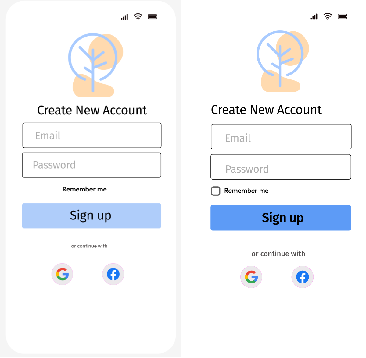
Issue 3: Absence of password verification on "create account"
Proposed Change: Include a password viewing
button to double check if entered in incorrectly

Issue 4: Color for CTA is not visible enough and the font “or continue with” is too small
Proposed
Change: Change the CTA color to a different blue and increase the font size for the social media option

Affinity Map

Loading Onboard/Process

Create Account/Log In/Inbox

Schedule an Appointment

Save Payment

Save an Article

Mockups

Final Learnings
- This project gave me a glimpse to how many users who have experienced health scare towards their loved ones out of a desire to spend longer time with them
- I learned that I had a tendency to be design oriented rather than focusing on the user and their needs - I needed to come back to the user and the problem repeatedly
What can I do better next time?
- Get better at scheduling interviews ahead of time as coordinating the interviews took longer than expected
- Explore different tools to help enhance user experience
- Include more usability tests after each prototype revisions